When we design your custom website, never using a theme or template, we do so in a way that is mobile responsive. This means that the single stunning design will work properly on mobile devices such as smartphones and tablets while also working on desktop computers and laptops. This is important because it means that regardless of how a potential customer comes to visit your website, they are greeted with a website, website experience and user experience (UX) that works for them and conveys the content and information that they are interested in.
So will you need iPhone 11 website updates so that your website displays properly on these new devices? You should not need any updates in the majority of cases – unless perhaps your website has very unique elements made in a specific size to perform in a very specific way. Websites are designed with what is known as ‘padding’ which allows for space around different design elements and also ‘tap targets’ which dictate where the mobile screen can be tapped to open a new page or go to a new link etc.
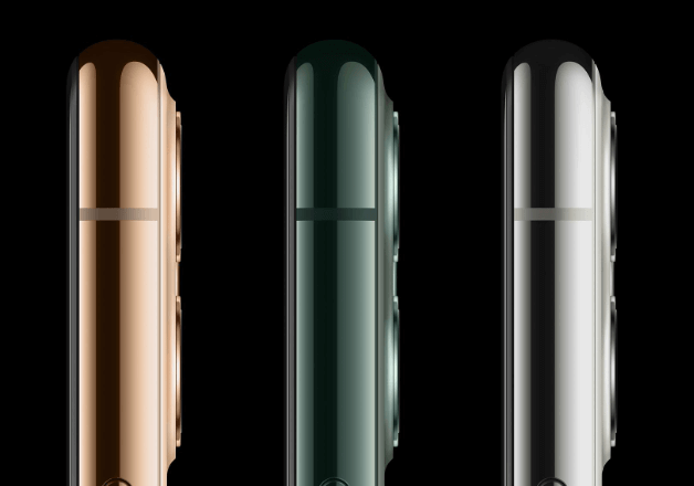
The new iPhone designs boast a 6.1 inch display for the standard model, a 5.8 inch display for the Pro model and a 6.5 inch screen for the Max model. As you can see, these may only be subtle differences – but they can make all the difference when displaying your website and all of the elements that it contains. That is what having a responsive website design is crucial in this modern day and age. It is something that we specialise in here at Webheads and is one of the many reasons that our on time and on budget custom website design can be a return on investment for your business.
So give us a call on 0207 287 7060 or email info@webheads.co.uk, or complete the form below.
We will use your email address to contact you regarding your query. We will not pass this on to any 3rd parties, in accordance with our privacy policy.